Library of Congress for Robots


Challenge
LC for Robots, a subset of LC Labs, faced the challenge of providing machine-readable access to its vast digital collections, aiming to make data more accessible to the public. Our team tackled this by conducting an eight-month project to assess client needs, understand target users, and develop a UX recommendation to enhance accessibility. The result was a set of design solutions that improved user experience and streamlined access to the Library of Congress collection data via APIs and bulk downloads.
New users express confusion using the site and noticed a lack of documentation.
Research Questions
Usability Issues
Context Obscurity
Niche User Base
Context Obscurity, Lack of contextual information for purpose of website and offered data.
Niche User Base, There is an average of 50 users per month, ranging from 0-80 user.
How do users who are experienced with APIs and datasets navigate the site vs. inexperienced users?
What kinds of features do experienced users look for in machine-readable data hubs and how do they use the resources?
What issues are there with the LC for Robots site’s web architecture and language in terms of effectively communicating the functionality of the website?
Key Insights
1
2
3


Primary Personas, The Expert Researcher


Design Overview


Design Rational: Home
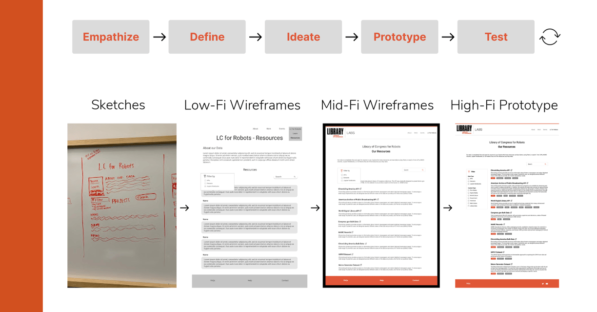
Design Rational: Resources
To create a more informative and engaging homepage for LC Labs, we focused on providing clear context about the site’s purpose. Replacing a single-sentence description, we introduced dedicated sections for About, Mission Statement, and Our Data, offering users a concise overview of the organization’s goals and resources.
Our iterative testing process, involving both experienced and novice users, ensured that each design iteration effectively met user needs and UX requirements. By breaking down information into manageable sections, we aimed to make the homepage more inviting and easier to navigate, aligning with both user feedback and the organization’s goals.
Users initially expressed that the website felt more tailored to returning visitors, prompting us to redesign for broader accessibility. To streamline resource discovery and meet the requirement of minimizing search time, we divided the page into three main sections: a filter panel, categorized resource descriptions, and a search bar.
The filter panel, positioned on the left, enables users to refine searches by access method, file format, and subject. Iterative testing confirmed that keeping the filter visible encouraged exploration. We also added metadata-rich tabs under each resource, detailing subject, access method, and file format, while a search bar at the top caters to experienced users by enabling direct resource searches.
Users spent an average of 26 seconds more exploring the redesigned website than the current version.
Resource comprehension improved:
Old website – 2/4 users accurately described how they could use a resource.
New website – 4/4 users accurately described how they could use a resource.
Resource discovery was faster:
Users found resources 14 seconds faster on average.
Users filtered by API and found relevant resources 12.25 seconds faster on average.
Users located resources related to learning skills 9 seconds faster on average.
User engagement increased:
Users spent 7.65 seconds more interacting with “Getting Started” materials.
Usability ratings improved:
Users found navigation and interaction easier in the new prototype.
All usability tasks were rated easier to complete, with an overall increase in ratings ranging from 0.5 to 2.38 points compared to the current website.
Results
View Interactive Prototype
Client: Library of Congress for Robots
Roles & Responsibilities: User Research: Competitive Analysis, User Interviews, Persona Mapping, Journey Mapping, Empathy Maps, Card Sorting UX Design: Sketches, Wireframing, Usability Testing
Timeline: 9 Months
